
The Analytics Events page strips the Overview and Campaigns dashboards down to a single dimension — event type — and focuses specifically on how well each event type is being claimed/attributed, and how that trends day over day. This article walks through each section of the page and explains what the data represents.
Accessing the Events Page
- Log in to Kochava.
- Select the desired Account.
- Select Analytics > Events.
The Events page sits alongside the other Analytics sub-pages — Overview, Campaigns, Incrementality, and Insights. Where Overview provides a broad, account-wide summary and Campaigns pivots around campaign, site, and ad-type performance, the Events page is purpose-built to drill into event-level attribution: how many events are being claimed versus unclaimed, broken out by individual event type, and how that trends over time.
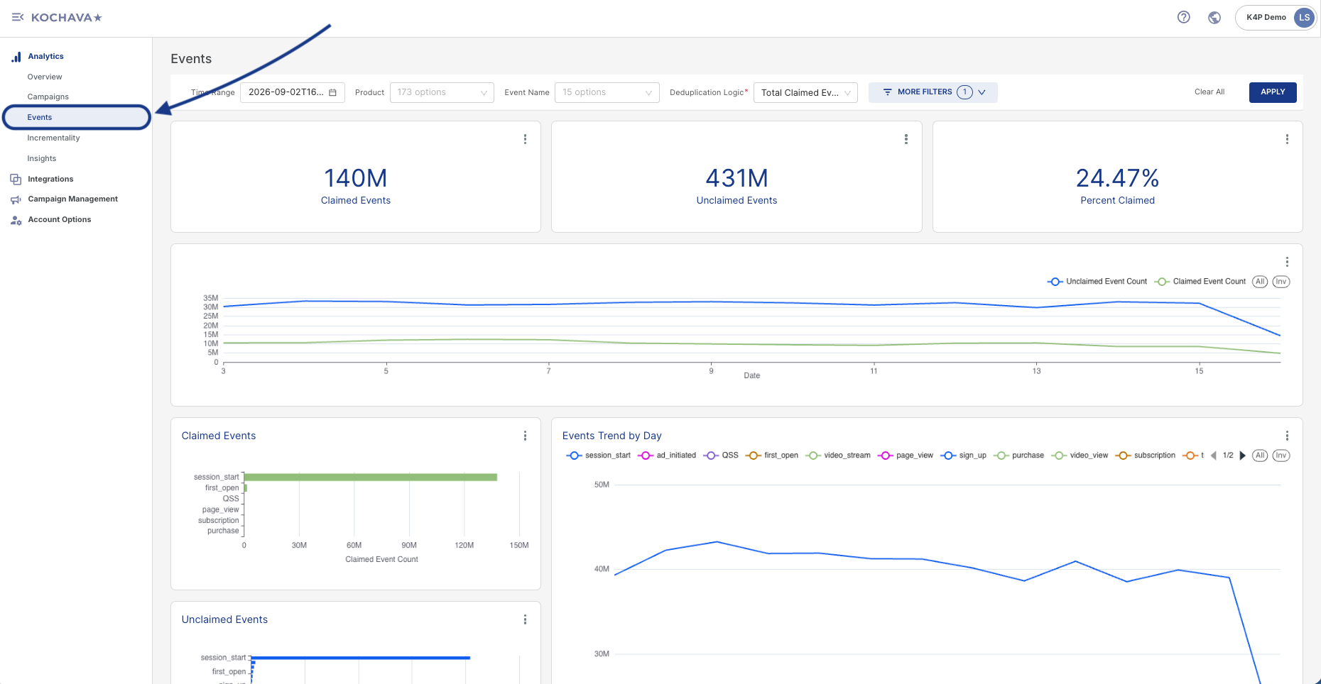
Filter Bar
A row of controls along the top of the dashboard scopes all data displayed below it:

Filter Options
- Time Range — Sets the date window for the dashboard, with a calendar icon available to adjust the range.
- Product — A dropdown listing all products/apps available to filter by within the account.
- Event Name — A dropdown listing the distinct event types tracked in the account (e.g.,
session_start,first_open,purchase). This filter is unique to the Events page. - Deduplication Logic — A required field with a dropdown that controls how the dashboard deduplicates events when calculating its metrics. Three options are available:
- First Claimed Event — Deduplicates down to only the very first successfully claimed/attributed event for a given user or device, discarding any subsequent claimed events. This is the most conservative option, and typically produces the lowest event counts of the three.
- First Unique Event — Deduplicates based on the first occurrence of each unique event, allowing multiple distinct event types to count per user rather than collapsing everything down to a single claim.
- Total Claimed Event(s) — Does not deduplicate down to a single event per user. Instead, counts all claimed events in aggregate, making this the least restrictive, highest-volume option of the three.
- Traffic/Conversion Included — A single-select dropdown (with a search field and an “×” to clear the current selection) that controls which traffic and conversion records are included in the dashboard’s calculations, based on their relationship to a device or user’s first claimed event. Three options are available:
- Only After First Claimed Event — The most restrictive option. Limits the dashboard’s traffic/conversion data to only what occurred after a user or device’s first successfully claimed (attributed) event, excluding all pre-claim activity.
- All Traffic Once First Claimed — A broader option. Includes all traffic from the point a first claim occurs onward, rather than filtering event-by-event as the option above does.
- All Traffic and Conversions — The least restrictive option. Includes all traffic and conversions regardless of claim status, providing the fullest, unfiltered view of activity.
- Partner — A dropdown listing all measurement/media partners available in the account. If left unselected, all partners are included in the current view.
Use Clear All to reset filters, or Apply to commit filter changes and refresh the dashboard.
Headline KPI Tiles
A row of three tiles provides an at-a-glance summary for the selected time range. Each tile includes the same three-dot (⋮) menu described in the Chart and Tile Options section below.
| KPI | Description |
|---|---|
| Claimed Events | Events that were successfully attributed (matched back) to a campaign or click. |
| Unclaimed Events | Events that occurred but could not be matched or attributed to a specific click or campaign. |
| Percent Claimed | The percentage of total events that were successfully claimed/attributed. |

Chart and Tile Options
Every individual tile and chart on the Events page — including the three headline KPI tiles, the main trend chart, the three stacked bar charts, and the Events Trend by Day chart — includes a three-dot (⋮) icon in its top-right corner. Clicking this icon opens a contextual menu with the following options:
- Force refresh — Manually triggers a fresh data pull for that specific chart or tile, rather than waiting for the dashboard’s scheduled refresh cycle. A timestamp next to this option shows how current that chart’s data currently is.
- Download — Opens a submenu with three export options:
- Export to .CSV — Downloads the underlying chart data as a raw CSV file.
- Export to Excel — Downloads the data as a formatted Excel (.xlsx) file.
- Download as image — Exports the chart itself as a static image file.

Unclaimed vs. Claimed Event Count Over Time
A wide dual-line trend chart plots Unclaimed Event Count against Claimed Event Count across the selected date range, both on the same left-hand axis. All and Inv toggle buttons above the chart allow switching between viewing all traffic or only invalid/rejected traffic.

Claimed Events, Unclaimed Events, and Conversion Rate by Event Type
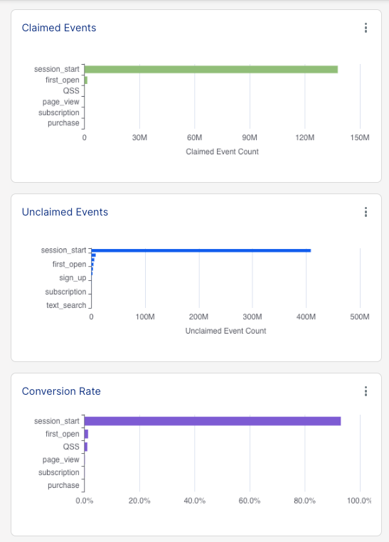
Three stacked horizontal bar charts break down the top-line metrics by individual event type:
- Claimed Events — Claimed event volume broken out by event type.
- Unclaimed Events — Unclaimed event volume broken out by event type.
- Conversion Rate — The percentage of events successfully claimed, broken out by event type.
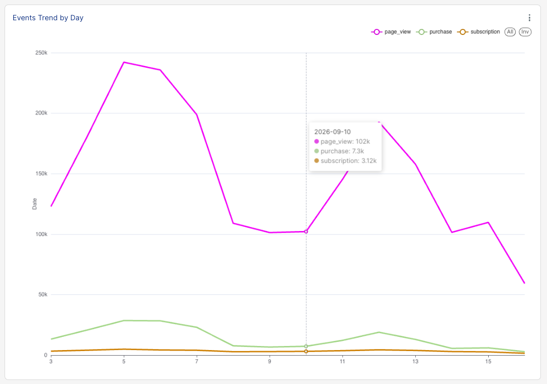
Events Trend by Day
This is the most detailed chart on the page — a multi-series line chart plotting daily trends for every tracked event type simultaneously, each represented by a distinct color and marker in the legend. The same All and Inv toggle buttons used elsewhere on the page are available above this chart as well.
Data Freshness
The footer of the dashboard displays a Last Refresh Time (UTC) indicator, confirming exactly when the underlying data was last pulled/updated.
