
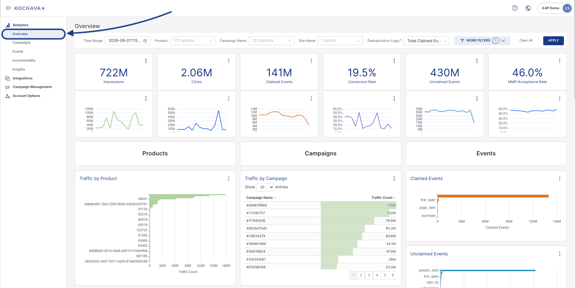
The Analytics Overview page provides a high-level, at-a-glance summary of an account’s marketing performance — combining top-line delivery metrics, attribution success rates, product/campaign breakdowns, Mobile Measurement Partner (MMP) validation results, and device-matching methodology in a single dashboard. This article walks through each section of the page and explains what the data represents.
Accessing the Overview Page
- Log in to Kochava.
- Select the desired Account.
- Select Analytics > Overview.
The Overview page sits alongside other Analytics sub-pages — Campaigns, Events, Incrementality, and Insights — each offering a deeper, dedicated view into that specific area. The Overview page is intended as a summary starting point rather than a full drill-down tool.
Filter Bar
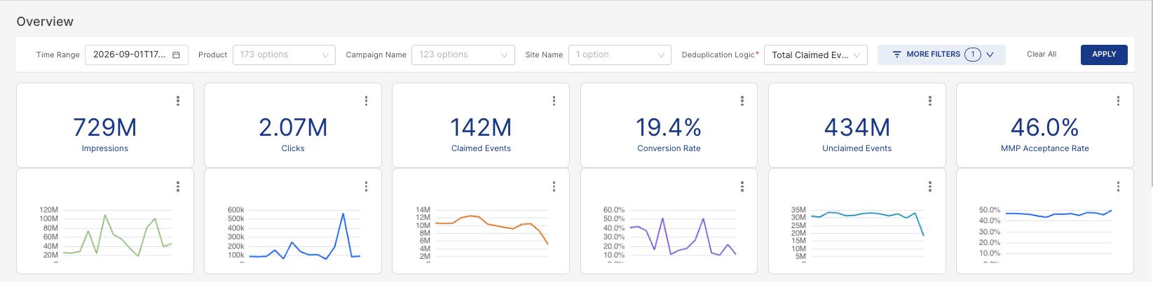
A row of controls along the top of the dashboard scopes all data displayed below it:
Filter Options
- Time Range — Sets the date window for the dashboard, with a calendar icon available to adjust the range.
- Product — A dropdown listing all products/apps available to filter by within the account.
- Campaign Name — A dropdown listing all campaigns available to filter by.
- Site Name — A dropdown listing the available traffic source(s)/site(s).
- Deduplication Logic — A required field with a dropdown that controls how the dashboard deduplicates events when calculating its metrics. Three options are available:
- First Claimed Event — Deduplicates down to only the very first successfully claimed/attributed event for a given user or device, discarding any subsequent claimed events. This is the most conservative option, and typically produces the lowest event counts of the three.
- First Unique Event — Deduplicates based on the first occurrence of each unique event, allowing multiple distinct event types to count per user rather than collapsing everything down to a single claim.
- Total Claimed Event(s) — Does not deduplicate down to a single event per user. Instead, counts all claimed events in aggregate, making this the least restrictive, highest-volume option of the three.
- Traffic/Conversion Included — A single-select dropdown (with a search field and an “×” to clear the current selection) that controls which traffic and conversion records are included in the dashboard’s calculations, based on their relationship to a device or user’s first claimed event. Three options are available:
- Only After First Claimed Event — The most restrictive option. Limits the dashboard’s traffic/conversion data to only what occurred after a user or device’s first successfully claimed (attributed) event, excluding all pre-claim activity.
- All Traffic Once First Claimed — A broader option. Includes all traffic from the point a first claim occurs onward, rather than filtering event-by-event as the option above does.
- All Traffic and Conversions — The least restrictive option. Includes all traffic and conversions regardless of claim status, providing the fullest, unfiltered view of activity.
- Partner — A dropdown listing all measurement/media partners available in the account. Selecting one or more partners scopes the dashboard to only that partner’s data; if left unselected, all partners are included in the current view.
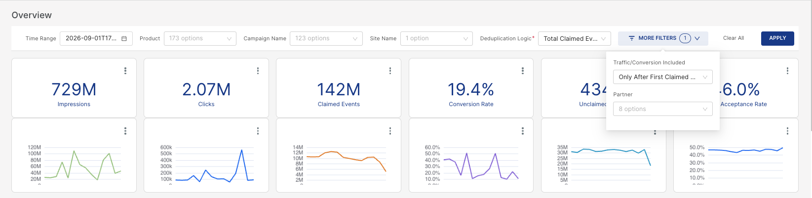
Chart and Tile Options
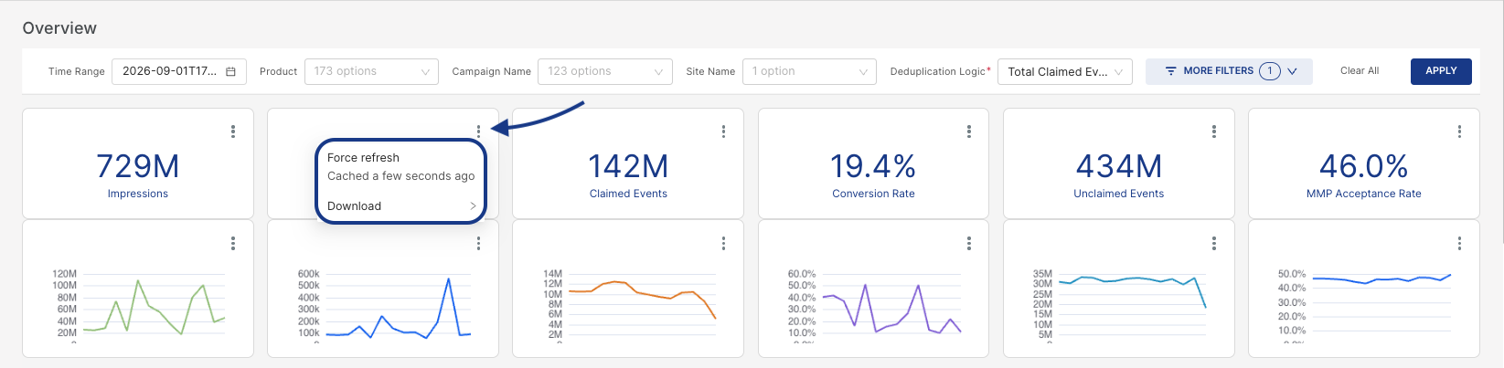
Every individual tile and chart throughout the Overview dashboard — including the six headline KPI tiles, their sparkline trend charts, and each chart within the Products, Campaigns, Events, MMP Acceptance, and Device Link sections — includes a three-dot (⋮) icon in its top-right corner. Clicking this icon opens a contextual menu with the following options:
- Force refresh — Manually triggers a fresh data pull for that specific chart or tile, rather than waiting for the dashboard’s scheduled refresh cycle. A timestamp next to this option (e.g., “Fetched an hour ago”) shows how current that chart’s data currently is.
- Download — Opens a submenu with three export options:
- Export to .CSV — Downloads the underlying chart data as a raw CSV file, useful for further analysis in spreadsheet tools or for importing into other systems.
- Export to Excel — Downloads the data as a formatted Excel (.xlsx) file.
- Download as image — Exports the chart itself as a static image file, useful for dropping directly into slide decks, reports, or emails without needing to rebuild the visualization elsewhere.
Headline KPI Tiles
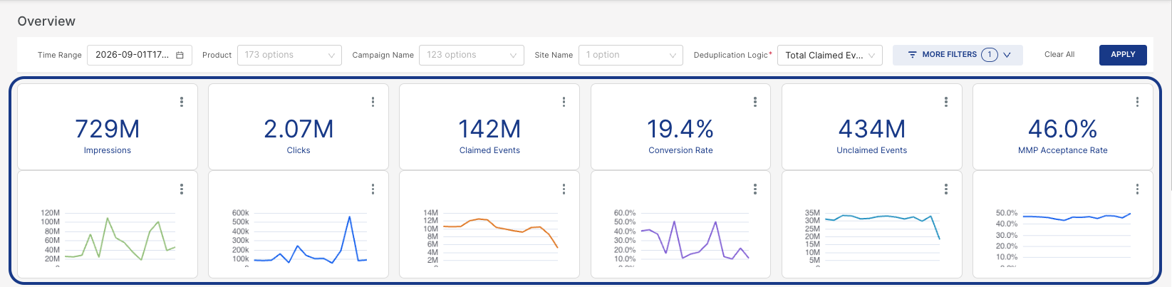
A row of six tiles provides an at-a-glance summary for the selected time range. Each tile pairs a summary total with a small sparkline trend chart, showing how that metric moved over the selected period.
| KPI | Description |
|---|---|
| Impressions | Total number of ad impressions served during the selected time range. |
| Clicks | Total number of clicks recorded on ads during the selected time range. |
| Claimed Events | Events that were successfully attributed (matched back) to a campaign or click. |
| Conversion Rate | The percentage of clicks (or claimed traffic) that converted into events. |
| Unclaimed Events | Events that occurred but could not be matched or attributed to a specific click or campaign. |
| MMP Acceptance Rate | The percentage of claimed events accepted/validated by the Mobile Measurement Partner (MMP). |
Products, Campaigns, and Events
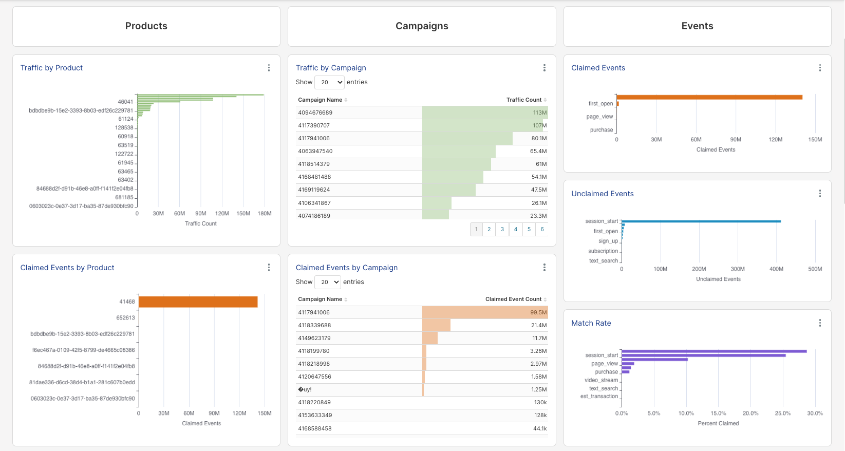
This section is organized into three parallel columns — Products, Campaigns, and Events — each providing charts or tables that break down traffic and attribution performance from a different angle.
Products
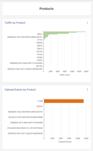
- Traffic by Product — A horizontal bar chart ranking products by total traffic volume.
- Claimed Events by Product — A horizontal bar chart ranking products by claimed event volume.
Campaigns
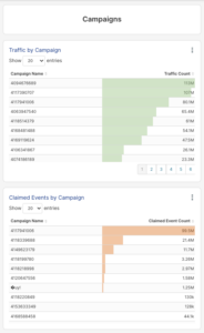
- Traffic by Campaign — A paginated, sortable table listing campaign IDs and traffic counts, with inline bars for quick visual comparison.
- Claimed Events by Campaign — Same table structure, ranking campaigns by claimed event volume instead of raw traffic.
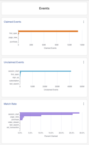
Events
- Claimed Events (by event type) — A bar chart showing claimed event volume broken out by event name (e.g.,
first_open,page_view,purchase). - Unclaimed Events (by event type) — A bar chart showing unclaimed event volume broken out by event name (e.g.,
session_start,first_open,sign_up,subscription,text_search). - Match Rate — A horizontal bar chart showing the percentage of each event type that successfully matched/claimed.
MMP Acceptance
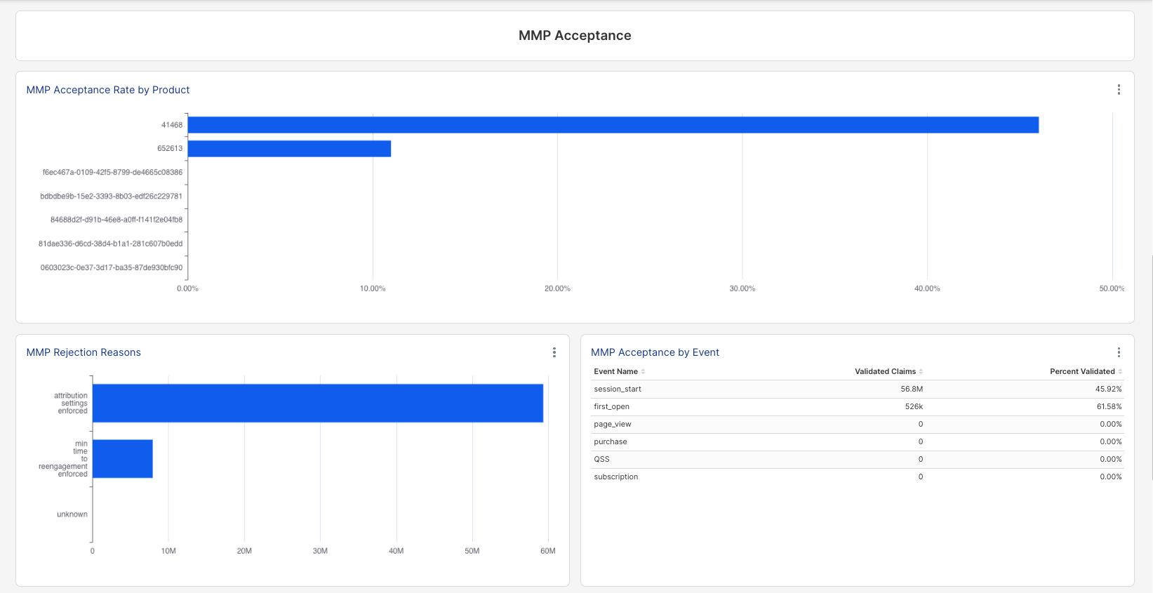
This section focuses on how the Mobile Measurement Partner (MMP) validates events that were claimed/attributed.
- MMP Acceptance Rate by Product — A horizontal bar chart ranking products by their acceptance rate percentage.
- MMP Rejection Reasons — A horizontal bar chart breaking down why claimed events were rejected by the MMP.
- MMP Acceptance by Event — A table cross-referencing event names with Validated Claims and Percent Validated.
Device Link
The Device Link section covers Kochava’s device-matching capability, showing how claimed events are being matched across different methods.
- Claim Event % Trend by Match Type — A layered chart plotting conversion rate over time, broken out by match-type category (overall/blended, Device Link, Fingerprint, and Device ID).
- Claimed Events by Match Type — A bar chart comparing claimed event volume across matching methods: Device ID, Fingerprint, and IP.
- Claim Event % by Match Type — The same three matching methods shown as a percentage breakdown rather than raw counts.
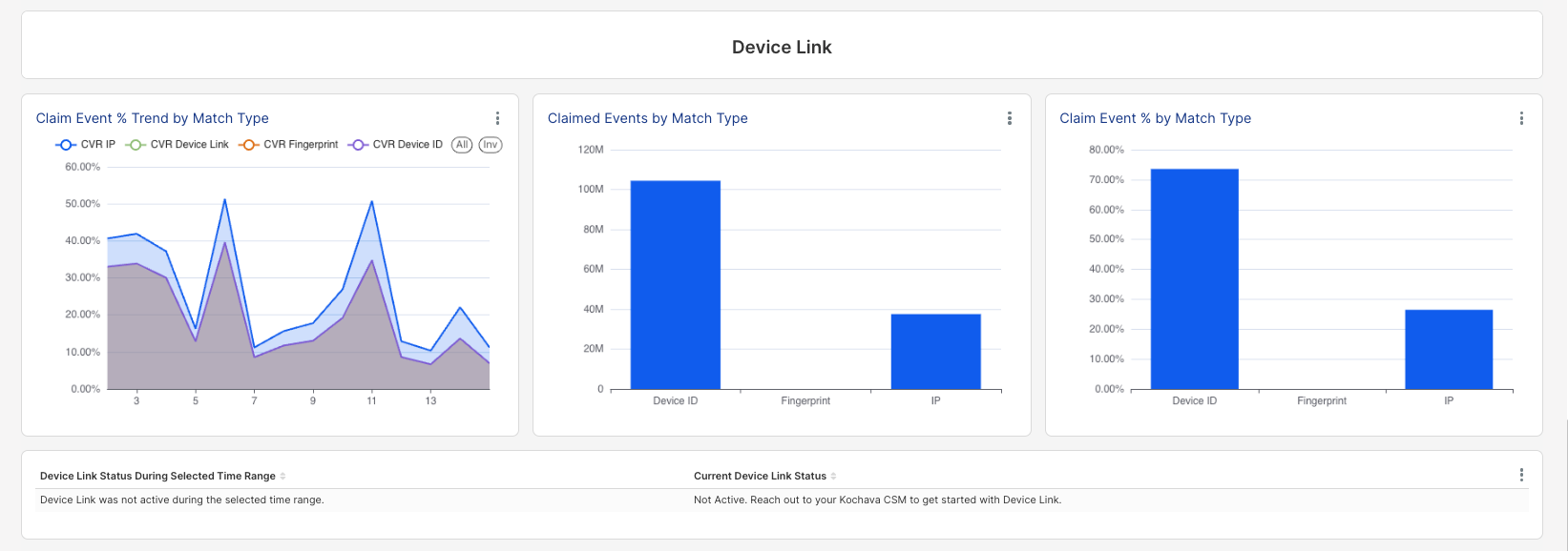
Below the charts, two status panels display the current state of Device Link for the account:
- Device Link Status During Selected Time Range — Confirms whether Device Link was active during the selected date window.
- Current Device Link Status — Confirms whether Device Link is currently active for the account.
Data Freshness
The footer of the dashboard displays a Last Refresh Time (UTC) indicator, confirming exactly when the underlying data was last pulled/updated. This provides useful context for interpreting how current the figures on the page are.
